Why i have chosen this ?.
I have chosen outline photography because it's different to what i would usually do in photography And looking through other peoples work of this on Pinterest has given me very good ideas of what i could do with this topic. After looking at Pinterest Ii have also looked at other artist that have expired me to do work like they have using their photography to then craft my own ideas. I think me choosing outline would be a good experience because there is a huge range of ideas i could do for this topic.Already i have ideas of what i could do so i now for this topic i am going to have a lot of experiments.
Outline photography artists.
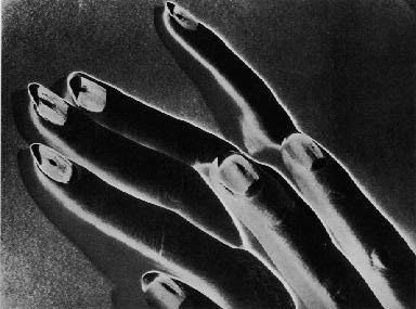
Man Ray
Here are a selection of images using outline taken by man ray, For Man Ray to take this images he painted on a ladies hands making an odd pattern on there hands making it not looking normal, For Man Ray to get the outline affect he edited them using solarisation in all of his outline images to get the effect showing the outline in his images that he has taken.


|
Man ray in this image has taken a normal image Although after taking his image he then developed the photo in solarisation to get the white outlines of the woman's hands. The white lighting in this image is artifical lighting as the white lighting was not in the original image.I like this image because of how the effect of solarisation gave the woman's hands and how he took the image with only half of the ladies other hand.This image has quite a high contrast with the mixture of black and white colours from after he edited it using solarisation.
|
Bill beckley


Billy Beckley is also an outline photographer he uses outlines using plants and having a plain white background.He concentrates on the whole plant and zooms into the stem of the flowers getting the dim lines of what makes up the plants.This is another good example of outlines showing more that you can create out of using outlines as Bill Beckley concentrates on plants with his view on outlines where as Man Ray uses hands with Solarisation.i don't like these images as much because the colours are too bright and i cant see the outline as clear as the other images i have seen of photographers using outlines in their work. If i could ask this photographer any question about these images i would ask him what made him take photographs out outlines using plants and why it is not as clear as the other outline images that different photographers have done.
Hugh William stuart
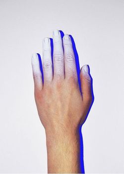
This image is very good because it shows outline really well, The way Hugh William Stuart made the outline in this image was by holding a Led light over either his hand or somebody else's hand to course a shadow being in light of what his object is he is taking the image off for example in this it would be the hand and the outline of the hand being the blue shadow. Hugh William Stuart used artifical lighting to get the shadow in this image you can this because the light is blue and bright when natural light wouldn't also be as bright as the light used in the image. Personally i quite like this image and how it got made i think it's a clever way of making a outline by using the effect of the led light also making the shadow reflect onto the white background making it clearer to see the reflection.
image analysis.
|
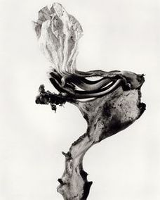
Joan FontcubertaThis image is used and taken in black and white, the image is of a dead looking plant. Joan Fontcuberta took this image in black and white to aim the image on the object changing where the background is a darker white then the plant on the image.The outline in this image is the whole object because the object is full so the outline is around the whole object. Joan Fontcuberta used this style with all of his outline images using other object to represent different outlines in full objects. a full object is a object with no gaps or anything interesting inside is so it just outlines the outside of the object.
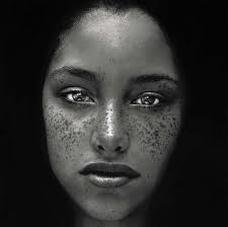
Irving PennIrving Penn , uses outline in this images taking the photo in a dark room focusing the photo on her face also the woman used in the photograph has black hair also blacking out the lighting so you can only see the woman's face which is the outline.I like this images because it shows the outline in the images really well and how he took this image in a simple way to get a good outcome.
|
MY brainstorm.
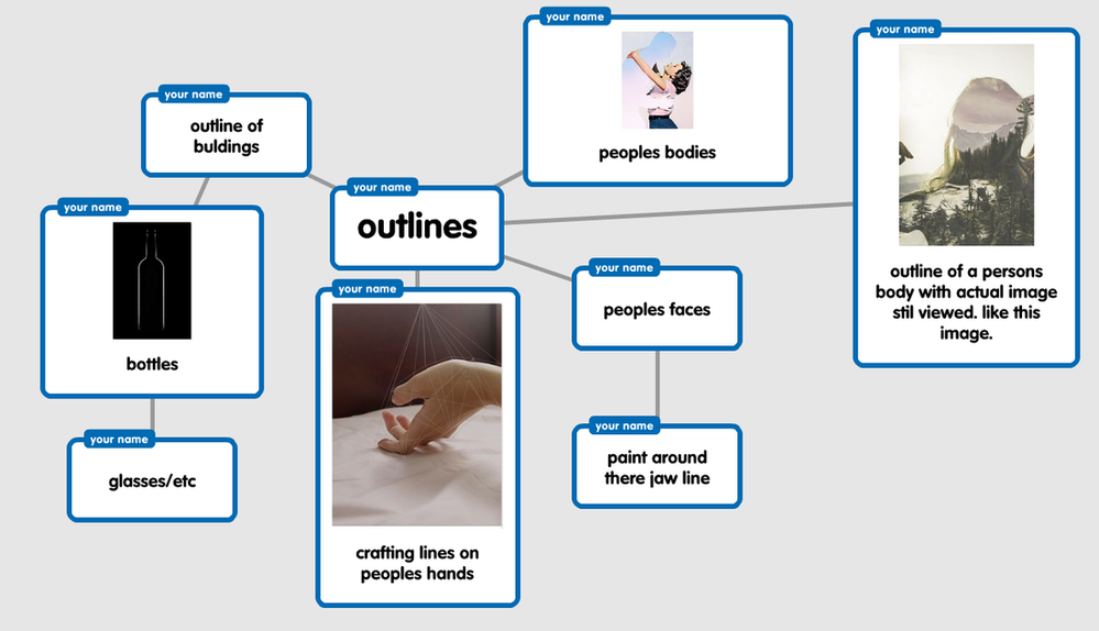
This is a brainstorm of ideas i will try out with outlines through out my exa. I think i could come out with very good experiments and a load more ideas while i'm going through the exam. I think i could get a lot of experiments done for this as there are so many images i can do even if they are based around the same images i can experiment them with other images similar to the first one i do.
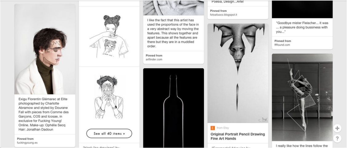
Pinterests board.
Experimentation 1
Here is my first selection of images i took around school.The group of images below are taken using natural photo's of outlines, The theme of this images are outlines and can clearly show what it is i have taken in the photo.These images work really well for my first experimentation in school.By doing this gives me another way of crafting and outline image. With my first experiment in images i am going to take one of the images i have taken below and going to high light the outline using adobe illustrator, Doing this will be quick and easy steps and is another way of showing outline in my photos.


Experiment using illustrator.
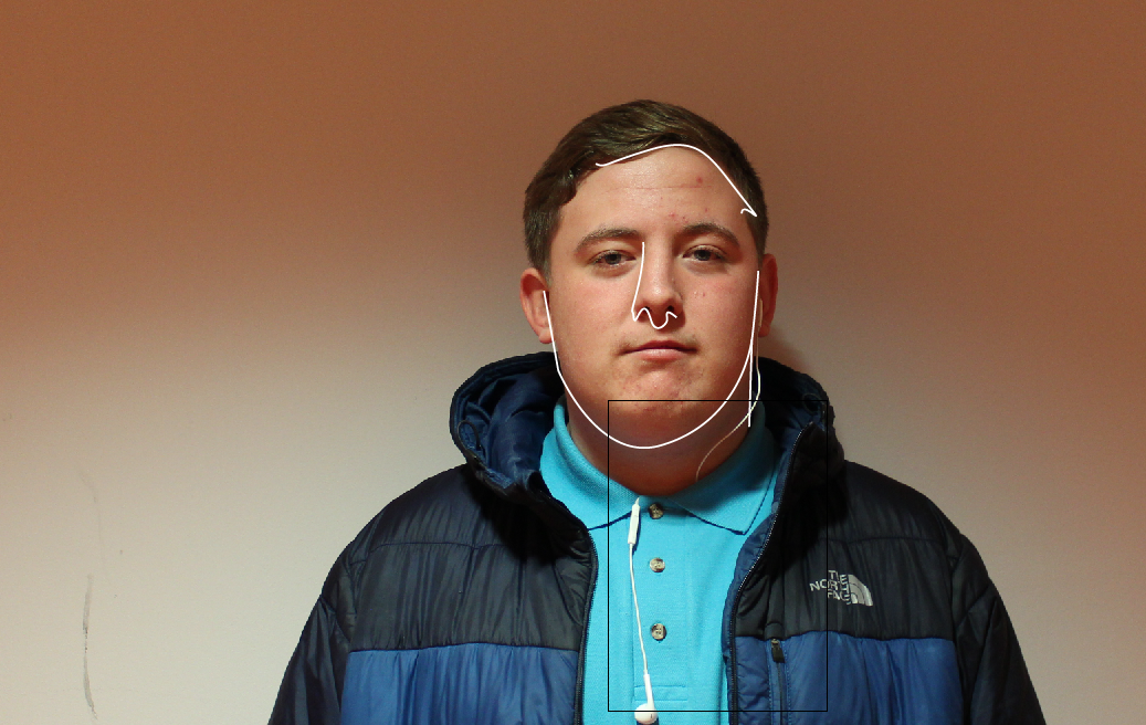
|
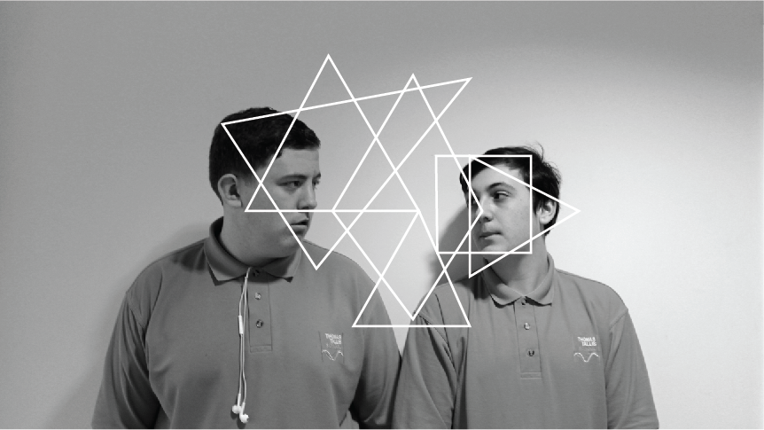
This is my experiment of using adobe illustrator. To do this image i had to upload the image into illustrator and click on the pen i had to change the pen to having no fill and changing the colour of the pen used to white. I had to change the thickness of the pen for it to come out clearer for me to be able to see the outline more clear. These were very easy steps to follow and it didn't take me very long to do this. I found this more easy crafting this image as i already had experiance with using illustrator in another subject. I think this goes well with my theme as it matches the criteria of outlines, I got this idea of using the pen to outline my friends face to draw out the outline's in his face like i used the pen to draw around his face to show there is outlines is this image. I got this idea by looking through my Pinterest and i pined it to my board with a couple of other image similar to this, I chose to do this because it was a first easy step into my experiments and i really liked how it looked so i chose to use this as my first experiment.
|
Experiment 2
|
This is my second experiment using illustrator to create a 2nd piece like the first one i have done , I prefer this one to the first a lot more because of how i changed the colour to black and white and i added a lot more detail in the drawing. This came out a lot more better by the fact that i made a lot more time to develop this image because the first one was a quick attempt and did not really come out as well as i wished it too.I really like the patterns i made over their faces although i do not like how this has linked with outlines so much as you could say apart from the fact of them having outlines of different shapes over their faces which are artifiical because i made them by my self with using the pen tool on illustrator.
|
Experimentation 3
This is another group of images i took around school, For these images i went for a different affect for outline and went around my school taking images of every outline i could think of that wasn't a basic outline. I changed the colour of the images using the colour on the camera to black and white, A lot of my images are out of focus because i thought it would be different to my other images and because of the photos being taken in black and white it makes the school have a different scene from making my school looking like normal school to it looking like i took images from a horror movie scene i chose to put the images in black and white for the different affect on the school making it look unusual. I didn't think my images would of came out to look unusual as i did aim to take a lot more images using shadows of objects / people for example the images of the tree taking images of the shadow on the floor or the photos of the boy standing in front of me with the shadow being the point of the image taking the shadow being the outline. My next step would be taking images of people and then using solarisation. I think so far all my ideas are linking together very clearly from the steps and development in them taking more images for me to choose from for what i like and dislike as a final piece . i may use some of these images for further development depending on how my next step goes if i don't like the next selection of photographs i will be using for the solarisation experiment.


Solarisation experiment
|
|
For these images i used solarisation, I used photoshop to get my images like this i had to do a couple simple steps to do so.
1:upload the image on photoshop. 2:i go onto options and change the image to invert. 3:then i click brightness and contrast and play around with them settings to get the image how i like it. i'm going to get more photos and develop them by doing solarisation to them to get more ideas for my next steps with outlines. I like how these images come out because the outlines of the people in my images come out really well as there a bright bold white colour where everything else is quite dark i think it gives off more effect them how the original images did. I have developed my images by making the from being in black and white to editing them making them in solarisation. |


Solarisation experiment 2
|
|
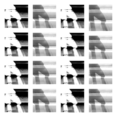
This is my second experiment with solarisation , With these images it makes the peoples bodies look like ghosts as where i made the original image a blur so the photo was out of focus giving off this effect when i edited the images threw photoshop.With this group of photos i changed the brightness to being low and the contrast quit low so the images was lighter compared to the others changing the affect on the image changing the style to give of a different feeling when you view the image. Out of my first and my second experiment i like the first one more by the contrast and brightness being darker to the second lot of images and how its only the bodies that are light in the 1st group of images.
|


Solarisation 3
|
|
This is another solarisation experiment I took this images from my last set of photos I took. The three images used came out really well with the setting of solarisation although I do not like the images it self and with the setting of solarisation i have done in these experiments. I recon if i played around with the settings a bit more i might find a setting i would like to suit the photographs in the group i have used. I like the link i have between my work at the moment because it fits in nicely together but this is my last group experiment of solarisation.
|


Solarisation evaluation.
By experimenting with solarisation by using photoshop i have now developed a new skill to changing the effect in my future images.I enjoyed being able to create new images by using solarisation because within the use of my images give the photo and different feeling and meaning to how the original image is. I have developed different ways for different effects in the images by changing the contrast and brightness or changing the exposure making the image come out in different ways. Now i know how to create images in different ways. I feel as if it does repeat after the second experiment you do , Although i found out by taking different images it does show different effects.
Before After


In this image I again used solarisation but I changed the levels and exposure of the image so I could make it different too how my first selection of using this technique. I like how this photo came out because it makes it look like its been made on black paper and I painted the image of as the branches look like splashed paint at the ends. I also like this image for how it outlines the tree in the bright bold white colour showing how it's a tree.this is how I wanted my outcome to look like so I'm like how the image looks different from where the original image and now. I aimed to make the final outcome look different to the original image making it so you have no background and that parts of the tree.
Keld Helmer-Peterson
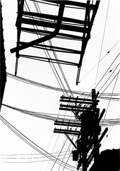
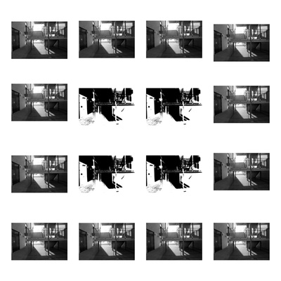
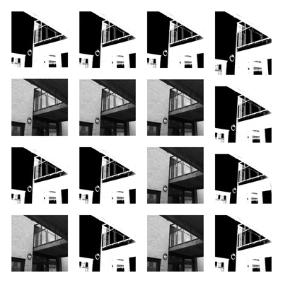
This is a group of images by Keld Helmer-peterson he concentrates on taking his images with high contrasts he takes a lot of images of fire escape stairs or crane from ship sites this is because they come out with a better outlines where there is not any other buliding etc in the way of the image so he can capture the buliding in what he wanted for the outline to be bold.


|
I found this artist Keld Helmer-Peterson and i found his work better then the solarisation because i feel like it it relates to my work better as he concentrates on the contrast within his images which then highlight the outlines in his images really well. Keld also tends to use buildings to get his images from just as the one I'm using for the example piece of his work. I quite like his work and wont to base my work more around to how his is for me to get a better range of experiments in my photography using ideas of other photographers.
|
Further experimentation


Here are some more images of my experiments of using solarisation, These images came out a little different to the other ones because of the purple effect used in the images. The reason to this is because the camera i used to take these images wouldn't change to black and white when i changed it in the option although i could of changed the colour after taking the images in photoshop i decided to leave it to see the different outcome and if i thought it worked well as much as the others, They did come out really well but i don't like them as much as the other 3 experiments I have done. Mainly based on the colour in these images as the purple makes me think differently about them. I do like the one image that came out in black and white pretty well which is the third image used as it came out in black and white the white shows out pretty clearly too it reminds me slightly of pop art with the bold thickness in colour.
|
Out of the 4 images above, This is my favourite of all i like it because of the high contrast with in the image as it has the wide range of colours being black , white and grey , Also i like how after the pole the colour scheme splits in half with in the image with the right side being in black and white and the left side having a mixture of the colours in the contrast. This image out of the 4 is the one that also stood out more to me as of the brighter colours used in the image. To make my image to have the colours used i changed the contrast and saturation in photoshop to make the image come out as it has in this photo, Although i did not make the image split in the two different sides of the right side in the image being darker then the left side in the image.
|
First outcome.


|
This is my first outcome, To craft this I had to take my original picture and then edit it in photoshop by changing the exposure in the adjustment settings To get the second image I made from the images above. After I followed them easy steps I used a website called 'Picmonkey' which is a free site on the internet for you to be able to edit and collage your images for free. I used this to be able to collage both the original image and the final edited image together for this outcome which is the two photos in the collage . I quite enjoyed making this as it was quick and easy and I also really like the outcome to my collage , Although if there was anything I would change about this it would be the way I set out the collage and maybe editing the original image into different colours as I have done before using my abstraction final piece in year 9. I think this piece came out really well as it looks like the artists work Keld Helmer-peterson. I try to base my work around his for this because with my first experiments of images they look quite similar only with some differences which I have made to make them look really similar to his , It was not hard to do so and I prefer the outcome I got when I based my work around his.
|
second outcome.


|
This is my second outcome , To create this I chose to do the same technique as my first outcome. I took the same image in the 3 different ways and have crafted my final piece into a collage of images exactly the same as my first outcome. Although I have changed the layout of the collage instead of keeping it with the same layout as the first piece I am going to use this continuous throughout all of my final pieces as its a neat outcome for my piece and goes well with it all being in a collage together. Out of this piece and the first piece would still be my favourite as it was the first one I edited with the best outcome I got so that would be my favourite.
|
Third outcome


|
This is my third piece , I like the effect of my shadow on the stairs after I put the image threw photoshop by changing the brightness and contrast then editing the exposure and gamma in the image because it gives my shadow a bright bold white effect of colour which I think then makes the images quite strong as it bold and bright coloured as there is also a lot of white within the final edited image. I like how I set out the collage in this one just of how it repeats in a way of the edited image and original image.
|
Fourth outcome


|
Here is my fourth piece again with the final collage I changed the layout for the collage making them go in a diagonal direction of with both images of the original image and the edited image from photoshop. Compared to my other images I do not like this one as much as the first , second and third. Making this image in photoshop is a lot harder then what it was to do with the others as the original image used in this has been taken with a slight blurt so i couldn't get exactly the right out come I was planning to get although this image did come out really good.
|
Fifth outcome.


|
My fifth piece includes, an image I took around my school from the front of the building I took this image with a digital camera like all of my other images taken on unit 2. I prefer this image compared to the last one because I feel like the editing for the final image came out a lot better as it is a clear image of mirrors showing the fact that it would shine with bright colours after I have edited it changing the brightness and contrast in my image. With the collage I am still changing the layout in the images of how they are presented.
|
Sixth outcome.


|
This is my sixth piece , I took this image today with along a load of other images which I haven't chosen to edit as this image and the image from my fifth final piece were my favourite images taken from the 30 I took. This image is one of my least favourite because I couldn't get the contrasts as high as I wanted to . Perhaps if I changed the angle I took the photo from it might be possible for me to get a better outcome. Even though I do not really like this image I like how the collage of my photo came out I like the pattern I did in the collage. If I could change anything about this photograph I would change the angle I took the photo at to get a better out come with the final photoshop piece I could also change the way I set out the collage although I like it how it is.
|
My final 4 pieces.


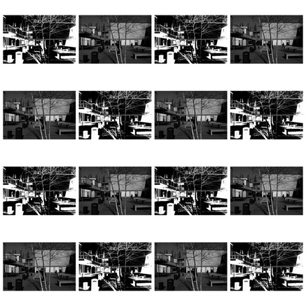
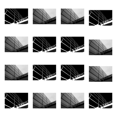
II have chose these three images because they were my favourite selection out of the 6 I have. These images work really well together as they have the same editing technique and share the same boldness in high contrast of the black and white colours. I liked how these images came out for how well the original image worked for me to be able to get the images like this with the darkness mixed with the high contrast changing the image to another picture making it look like something else. These images are different by the way I have laid them out , Because they are taken around architecture.


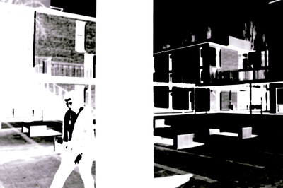
When I took these images originally using the camera they were sharp images, But then i developed them in the Dark room using photograms , I used the original image and developed it in photoshop inverting the images I then developed them using photograms in the Dark room making them come out with a blur effect making the images negative. I found doing this successful as I like the way all three images came out and the negative blurred effect given to the images. I particularly like the first image the most because of how it gives a different effect to how it did when the image was originally taken. The image affect being developed gives a horrific affect for how the tree and the shadow of the tree has black smudges which reflects the look of blood , it makes the images spooky the effect also changes for how certain areas of the images have bold black and white sections such as the far left with the building and the tree being in complete darkness. If I was too develop these images I would try to do this method without inverting them firstly on photoshop to see how the effect could change and if it would give a different mood to the images. I chose these three images for my final piece because threw out the whole of unit 2 I was developing my images to get to my final outcome and I like how the outcome has came out and I think it was a good way to end my unit for my exam.
Final evaluation
The theme I chose is Outlines , I chose this because I felt like it would be an intersting topic to choose as I knew it would give me the opportunity to experiment with lots of techniques. While still using photoshop like I did in my past work but making a difference by just changing the contrast in my images developing it to my final piece.
I begun my theme by looking at pinterests making a pin board of all the ideas I could take of outlines for me to create my own pieces. The first piece I made was self portraits of my friend I used illustrator to draw pen around his face crafting out points in his face highlight it with the pen tool from illustrator I got this idea from an artists called Charlotte Abromwah. My first attempt at this was not so good , Although when I made my second experiment of this I used another image and did shapes instead of the structures on peoples faces. I feel like my second experiment was a lot more better as the final out come was really good compared to my first. After I did those experiments I went around The school and took a huge selection of photos. Once I did this I took a certain amount of the images and edited them using photoshop , The artists I looked at for me to move onto further development was Man Ray I took his idea of using solarisation because it seemed like a good effect but I wanted to change it in a way of using solarisation digitally by changing it using photoshop as Man Ray took his by using a darkroom. I took the image and inverted the image after I inverted the image I then changed the contrast and saturation to show i had used solarisation to craft the experiments I had done, Once i did that I chose to do 3 experiments using that technique and evaluated them in detail saying what it is i had done and changed, afterwards I did a before and after photo of me messing around using photoshop again trying to get a different outcome for the image I chose to see if it would come out and be developed in another way. I also did an further experiment which did not work as good as my other images I did previously because of how the colours came out and how high the contrast was although I did choose to then take more images which I have then chose to use for my final piece which means I took the 3 images threw the same process although afterwards I then printed out the photo and reflected it on photographic paper developing my images for it to come out as a photogram which I am using for my unit 2 final piece. Overall I enjoyed doing unit 2 because it was clear for me to see my work developing in ideas to showing how I came to get my outcome in the end of the unit, I found it interesting and would enjoy doing some of the techniques I learnt in this unit for further work in my photography.
I begun my theme by looking at pinterests making a pin board of all the ideas I could take of outlines for me to create my own pieces. The first piece I made was self portraits of my friend I used illustrator to draw pen around his face crafting out points in his face highlight it with the pen tool from illustrator I got this idea from an artists called Charlotte Abromwah. My first attempt at this was not so good , Although when I made my second experiment of this I used another image and did shapes instead of the structures on peoples faces. I feel like my second experiment was a lot more better as the final out come was really good compared to my first. After I did those experiments I went around The school and took a huge selection of photos. Once I did this I took a certain amount of the images and edited them using photoshop , The artists I looked at for me to move onto further development was Man Ray I took his idea of using solarisation because it seemed like a good effect but I wanted to change it in a way of using solarisation digitally by changing it using photoshop as Man Ray took his by using a darkroom. I took the image and inverted the image after I inverted the image I then changed the contrast and saturation to show i had used solarisation to craft the experiments I had done, Once i did that I chose to do 3 experiments using that technique and evaluated them in detail saying what it is i had done and changed, afterwards I did a before and after photo of me messing around using photoshop again trying to get a different outcome for the image I chose to see if it would come out and be developed in another way. I also did an further experiment which did not work as good as my other images I did previously because of how the colours came out and how high the contrast was although I did choose to then take more images which I have then chose to use for my final piece which means I took the 3 images threw the same process although afterwards I then printed out the photo and reflected it on photographic paper developing my images for it to come out as a photogram which I am using for my unit 2 final piece. Overall I enjoyed doing unit 2 because it was clear for me to see my work developing in ideas to showing how I came to get my outcome in the end of the unit, I found it interesting and would enjoy doing some of the techniques I learnt in this unit for further work in my photography.
