What is chiaroscuro ?
chiaroscuro is the use of strong and soft contrast within light and dark light usual strong contrasts effect the whole composition.This is used to contrast different light within a model.object or any dimensional objects.It gives of dramatic effects within the images.The image is always in black and white the less light the less pure the photograph would be.
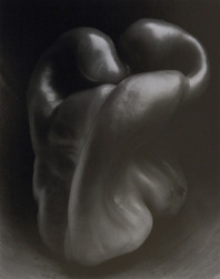
Edward weston
|
Edward weston took this photography,he structured the picture in a way to make the pepper look mutated and freaky.
|
Contrast photography work


Down along the side are a bunch of images me and a small group took turns in one person controlled the lightening of the image choosing how dark or light the images would decide to come out to look like,the model would just sit there while the person taking the picture would decide how he would want him to pose well to look like just for the photo for it to have a good coming out come,I would say we did quite well on too bunch of photos the one of the first model (ben) and the second (me)because the lightening come out to be quite bright on bens body and really dark on the background or half the image would be brighter one side and dark the other,whilst on the photographs of me,The photo mainly comes out all dark and aims the light to just be shinned onto my face by reflecting it onto a shiny cover so the light reflects of that and by using the flash on the camera it would capture the light and aim on my face as the come out in the image.On bens sets of images it gives off a quite happy bright effect while on my photos it lead to being dark due to all the lighting and how we chose to capture the photographs
Elliott Erwitt
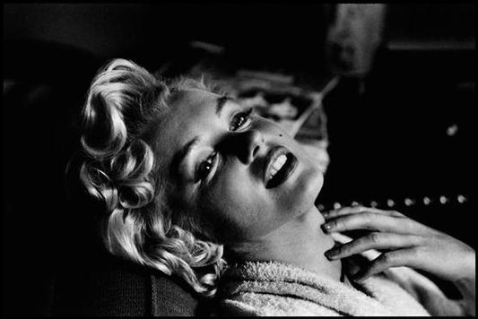
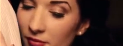
Elliott Erwritt, took this images and yeaa its not been taken with a black background behind the woman but i like the fact that light has just been focused on her faces and her surroundings are just a filled black background where everything is just focused on her face so she stands out.
Composition
light-natural/harsh sharp/soft
Composition
light-natural/harsh sharp/soft
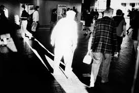
Trent Parke
|
Trent parke,in this one photo concentrates on the old mans body because the light reflects his whole body where you can not even see his facial expression or the colour of his clothes and everyone else is just surrounding him with exposure on them so you can see what they are wearing.
|
|
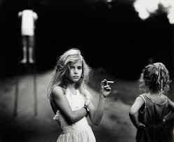
sally man
|
In this images sally man has left lighting on the people in front of the camera and the white shirt on the left corner of the image and where the trees in the background are black just dark so you cant see it and the photo looks like it has also been filtererd
|
Tom Hunter
|
just like Elliot Erwitt,Tom hunter and use his background on just being black and letting the light focus on the models face to make the photo to give off more emotion in the models face perhaps??
|
|
Fay Godwin
|
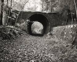
i quite like the way Fay Godwin had taken this image because of the dark light used in the tunnel and most of her photos are usually in black and white generally so some areas shall be lighter and darker then other but its the photo it self i like the fact throw the tunnel it has a big depth of field as you can just wonder your eyes off into the pathway and imagine every thing else beyond the point of seeing,Also out of all of her images this one just caught my eye the most its quite a dark photo in my opinion but i do not know why it just gives me a feeling of darkness in the image but its just a black and white photo taken in a park.
|
Elliot ewritt
|
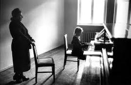
In this photograph i see a woman and a little girl i think maybe the woman is giving the girl piano lessons,the emotion this photo gives off is just plain and boring but interesting in a way,if i was to describe this image to a person who couldnt see it i would tell them that its an black and white image with a lot of bright white light on the wayy where the woman is quite blacked out and the light is aimed on the wall,the little girl and a part of the piano that she is playing,i think its a naturalistic image because you wouldnt really need to plan out an image too look like this such as abstraction.nothing really seems new to me it is just a dull plain black and white image with a lot of light reflecting of the wall i recoqnize the little girl playing the piano because it is quite obvious what the picture is.
|
pinterest board

Aaron siskind
|
most of aarons images are mainly photographs of walls in black and white with contrast with picture of walls with paint peeled of them or same as poster on the walls getting peeled of the wall as you can see from the images to the side of this text.aarons siskind work is also weirdly structed in a odd looking way his photographs have mainly looked like they been made to look as how they look.
|
|
pinterest artist
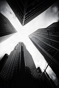
here is an image that a photographer on pinterest has taken i find this images quite interesting on the way that it has a strong contrast from the bottom of the buliding being the contrast full of darkness as the image brightens up going up the building into the the sky being big and bright outstanding and bold the contrast of it being black and white is intresting and i might try to take some of my images just like these there was another photographer on pinterest who did work just like this but more on shadows and with an skateboarding theme but while using contrast in his images.
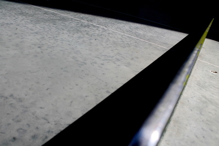
my first experiment of contrast.
|
|
here are my first bunch of photographs i took of contrast based on the pintrest artist i found i quite like theese images due to the fact that it gives of your darkness and the light such as in one of my view images the background is in a dark and the metal and the sun is in the light.i think next time with my images i may try to add a whole different range of images to my work and look at other artists for a wider range of looking threw into contrast photography.
|
examples of contrast:2
|
|
This here to the left are 9 photos i took during my weekend of contrast mixtures between light and dark lights for my first attempt of some outside of school they were some of a decent attempt but some i took more are off then others as you could may tell.
My favourite two images i took out of this selection would be the one of the underground train driving past where the train is in a blur and the lights from inside the train are bright,where as on the top and bottom of the photo the colour goes quit dark.My other favourite would be the one of the tree as because of the photo being in black and white you and see loads of darkness in the photo mixed with bright as you go and look up into the photo,The main focus on this photo would have to be where the leaves are in dark light for me thats what i mainly focused on after i took this image so maybe ill take some more images like that. My least favourite is the very first image of the bush and my leg as it does not show much change within the light and darkness within the image all you see is light as it being a bright and non dark photo. |


research of pinterest artist photography.
|
|
In these images i was looking at a photographer that i found on pinterest.if you scroll up and look at the bulding of the sky scrappers thats the photographer who i was looking at to take these photo around the school.this photo have gone a lot better then the ones at the top of these because i am starting to get a idear of what i am going to do as my final piece for this subject.
I only have one favourite image out of these 11 photographs and i think it would be the first one of the tree because it goes from light to dark and light again which i find how i may keep my images to look like. |


chiarscuro within contrast
|
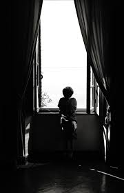
chiascuro is most likely in some contrast images as chiascuro is the differences into dark and light in the images witch is just like our contrast subject where coulour goes from dark to light coulours with out not needing to turn the image to black and white just use shadows off buildings or focusing on different sections of what your trying to take an image off.Just like this image here instead of going up from dark to light it has patches of light coming threw into photo,This is quite a good example as i really like the image where you have the light from outside giving shape around the boy sitting down in front of the window by using the chruoscuro and contrast.
|
|
examples of contrast:3
|
Here are my final experiments with contrast,I took these images around school and i recon they had all come out really well.My favourite image out of these would be the one of the table tennis table as i like the fact its just the net that is in colour with a little section of the table in colour and the rest being the background in black which i did by taking just a ordinary picture.
|
|
Evaluation:1
Out of those images this is my favourite image i took by the fact that it looks rather abstract and so do the others out of that slide show above.What i really like about this photo is the fact that the net and the table is lit up and the shadow of the net and the rest of the image is in a black colour surrounding the light of the image.
My exam pictures
|
These here are my exam pictures,I aimed to take my photos to look as abstract as i could and i then edited them on photoshop changing the brightness and contrast to get the dark and light colours i was also aiming for.These photos have dark and light areas which is just what i aimed for i dont like some of the images but the aim of the abstraction and contrast went well together just as i planned for it to be.
my favourite image would be the one of the wooden bench in an angle with the lens getting the inside gap of the bench where the seat is held together,Reasons for this is because if gives of a depth of field with in the image going up the wooden strap of the bench to the end of it and it also looks like it is angled going in to each other,Other reason why i like this image is because the dark light at the bottom of the panel in the bench is quite dark which for me is what i first notice the darkness going up from being really dark to light then going along till the end of the bench. |
|
|
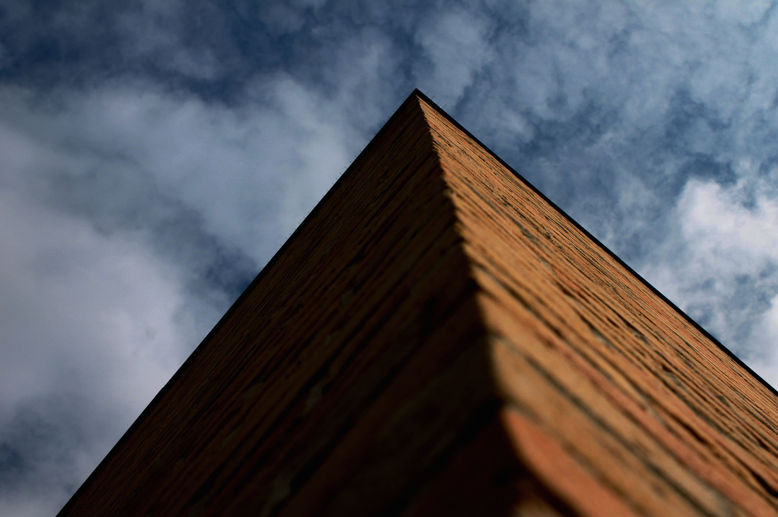
This here is another good example from my images as on the left side of the building it is really dark and has no light where in the sky the colour also stays the same but on the right side of the building the light stayed the same brightness where as i said the left side being a dark colour gives of the contrast within the image,Although i got the colour and contrast in this image i did not capture the abstraction in the image as it is just a building going up pointing into the sky with clouds around the upper part of the image.My intension for this photo was to make one side of the building dark and the other side of the building in light and to also keep the sky in the original colour and lightness that it was first taken in.The light source within this image is in the sky with the clouds that gives of quite a soft light in my photo.The colours in my images are quite bold and thick,Because you can see the colours clearly an what the colour is.I like the way i have a dark and light on each sides of the building which gives off contrast in my image where i also have the sky being light above the image giving of the light within the photograph.
|
|
Final piece
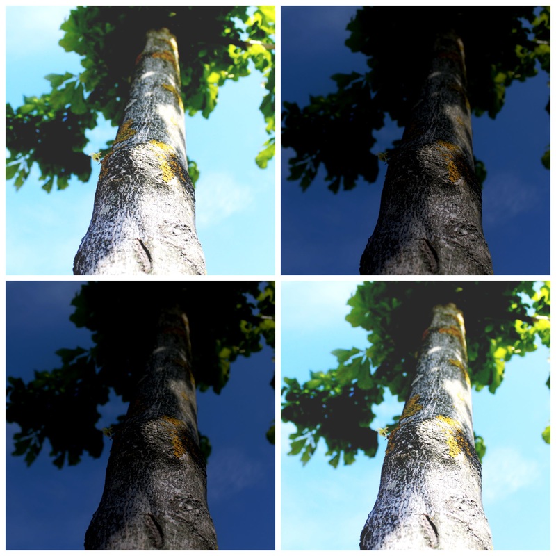
This is a collage i have made from a website called pic monkey,I took the image of the tree and i also edited the change of brightness and contrast within the image on photoshop , I then made the photo collage on the website pic monkey.I quite enjoyed making this image go together and was just a quick idea at the time i then decided to make another collage using the same image but changing the colours around to give it an pop art theme.
|
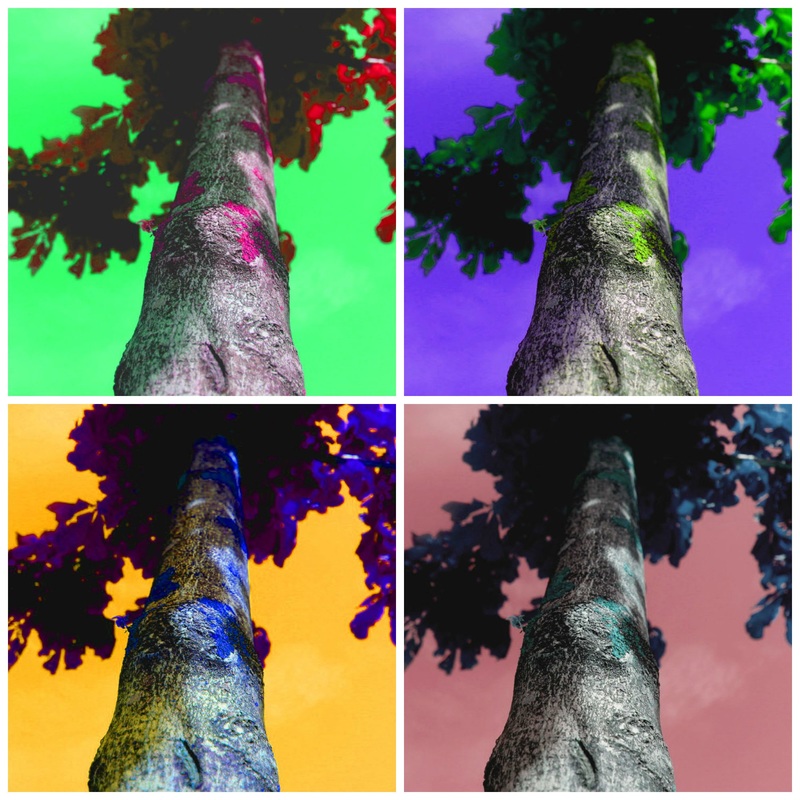
This is the outcome of the photo collage i made,To change the colours i used photoshop to change the colour of different sections in each 4 images in the collage.I like the way the collage came out because i didn't think it would of had the outcome i wanted it to have and it did so I'm rather happy with what i did for my final piece in my my abstraction work.I think from how this work came out that i would like to try it again with other objects in photography.I really like how the clouds in the background on the bottom right image is a dark pink colour that makes the sky look really cloudy instead of knowing the clouds are there.
|
